


Why your website should be mobile-optimised
05/04/18
3'
Used by 70% of the global population according to We Are Social, mobile phones have become a key channel in a shopper’s buying journey. Whatever the time or place, consumers go straight to their phones to get more information and/or make a purchase.

It is high time that brands and retailers start thinking ‘mobile first’, as evidenced by UPS’s most recent study, ‘2017 UPS Europe Pulse of the Online Shopper’ (February 2018). This is especially true in a world where mobile internet is outpacing traditional broadband.
Google rewards mobile site optimisation
Since 2015, Google has favoured mobile-friendly sites in its search results. The following year, the search engine made further updates to its algorithm to promote such websites, making it easier for mobile users to engage with Google.
Furthermore, Google recommends website owners opt for the Accelerated Mobile Pages (AMP) format. Launched in 2015, Google AMP is an open source technology allowing sites to increase their visibility in mobile search results, all while improving their loading time. According to Google, more than 30 million domains have adopted the technology for their site.
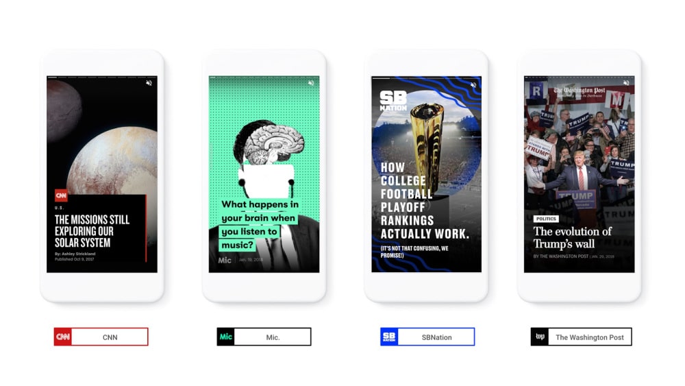
The American giant plans on going even further by launching a new AMP format called ‘Stories’, aimed at the media. Similar to the ‘Discover’ page on Snapchat, these Stories will be interactive and mobile-optimised experiences.
Always attempting to improve user experience, Google recently announced that from July 2018, it’s algorithm will penalise mobile sites (both on smartphone and tablet) whose loading times take too long.
And if you would like to advertise your product catalogue on mobile with Google Shopping, you should know that your e-commerce site has to be mobile-optimised. To find out more, read our article ‘Optimise your Google Shopping ads on mobile’.
Close to half of all purchases are made on mobile in Europe
According to We Are Social, 60% of mobile connections are made in high speed and 90% of internet users are also mobile users. This behaviour not only fosters information searches, but also mobile purchasing. While 43% of smartphone users in Europe used the channel to make a purchase in 2017 (UPS study), it’s the UK, Germany and France that had the most mobile consumers.
Whether it’s on a European scale or a global one, the findings are clear. Mobile purchases are increasing, but e-commerce sites still have work to do when it comes to offering a smooth and fluid mobile shopping journey to consumers.
To compensate for this, consider using mobile marketplaces. Whether it’s a mobile-adapted marketplace or a mobile shopping app, these platforms allow you to increase your visibility on mobile beyond the confines of your online shop.
Mobile takes over social media
While more and more shoppers are making the leap to mobile for online shopping, the buying journey often begins on social media.
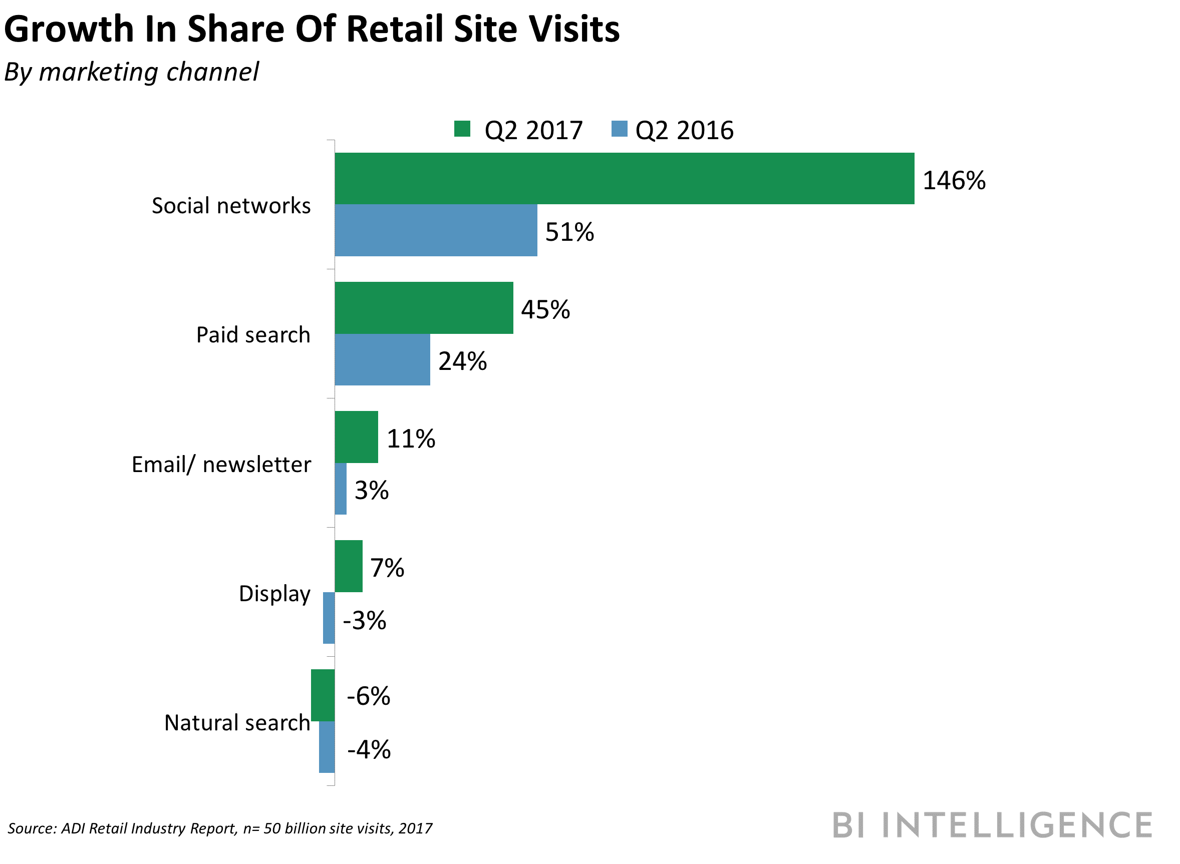
More than 40% of the world is on social media, with Facebook being most popular with its 2 billion users worldwide, of which almost 90% access the platform from a mobile device. Furthermore, according to the latest BI Intelligence report, Facebook seems to be the big winner when it comes to social commerce.
However, this phenomenon is not unique to Facebook as other mobile social platforms such as Whatsapp, Facebook Messenger and Wechat have become platforms for conversation between brands and consumers.
Your e-commerce library
Sign up for our newsletter
By submitting this form you authorize Lengow to process your data for the purpose of sending you Lengow newsletters . You have the right to access, rectify and delete this data, to oppose its processing, to limit its use, to render it portable and to define the guidelines relating to its fate in the event of death. You can exercise these rights at any time by writing to dpo@lengow.com

Trending Posts
Marketplaces
9 essential tips for selling on marketplaces (2024)
In 2024, selling on marketplaces is a real challenge. Rivalry between sellers is intensifying, and the range of marketplaces is…
18/01/24
7'
Marketplaces
How to Sell on Temu? Best Tips
Emerging under the vast umbrella of PDD Holdings Inc., Temu has skyrocketed in popularity as a shopping sensation from China…
17/08/23
5'
Marketplaces
The Top 10 Marketplaces in Europe
The e-commerce scene is a vibrant mix of marketplaces in Europe. These aren't just websites; they're bustling hubs where millions…
08/12/23
7'
Google Shopping
4 Must-have Google Shopping Optimizations [2024]
Google Shopping isn't just another advertising channel; it's the undisputed titan of paid e-commerce advertising channels. And why is that?…
11/01/24
9'
Price Intelligence
Winning with Pricing Strategy on Marketplaces
Selling successfully on marketplaces like Amazon and eBay hinges on how well you price your products. It's a balancing act:…
24/11/23
7'