


[Guest Post] Google AMP: An Open Source Format for Mobile
21/02/17
3'
The results are in – according to Ecommerce News, in 2016, 54% of online sales in the UK were from mobile devices. Ecommerce sites therefore need to meet this growing trend and adapt to smartphones and tablets. However, the road to a totally “mobile friendly” site is not short. So, in 2016, Google released their new mobile format: the AMP (Accelerated Mobile Pages), to help web pages load faster and operate smoother on mobile devices.

To discuss this further, we asked Enrick Pellegrin, Communications Manager at French ecommerce solution WiziShop, to contribute his expertise on the subject. WiziShop is the first e-commerce solution in the world to offer the AMP format natively.
An Open Source format
The Google AMP format is based on reducing code to instantly display content, giving mobile users a better browsing experience. According to Google, page loading time can be anywhere between 15% and 85% faster. This is due to several different things:
- Google only loads the code that’s visible on screen.
- The Google AMP Cache stores all pages in AMP format to pre-load them. This caching allows you to directly redistribute AMP pages to mobile users.
- HTML code is reduced – it contains 5 times less tracking code than that of the “classic” format, which helps pages load faster.
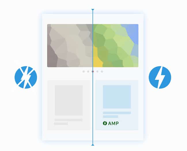
This AMP format is also Open Source, with site architecture provided by Google. You’ve probably already come across it whilst browsing on your phone: the AMP format is shown in a grey symbol – a lightning flash in a circle. At the moment, it’s usually displayed in the Google News Carousel, an interactive display that relays all articles from media sites. The technical conditions to apply and have a chance to be posted on the Google News Carousel are:
- Your content must be in AMP format,
- Your code must contain the appropriate structured data tags, and
- You should be using an Atom XML thread to track URLs for your content.
You can also find the AMP logo in front of the meta descriptions of some sites. This means that pages are already stored in Google’s caches and instantly redistributed to visitors when browsing on mobile.
The early stages of AMP
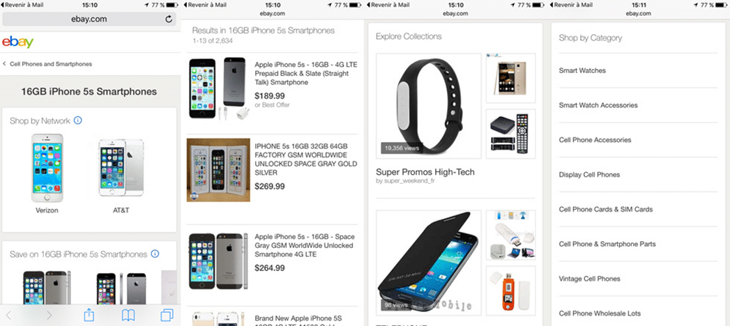
In February 2016, this new format was adopted by various different media sites. A few months later, Google launched its new e-commerce format, with eBay becoming the first site to start using AMP.
However, certain pages on ecommerce sites still can’t adapt to AMP yet. For example, the checkout, the shopping cart page, and the application of filters are, at the moment, only available in the “classic” mobile format.
Why adopt to the AMP format?
Be more mobile-friendly
A site designed in AMP format allows for a much better browsing experience with optimised content. Mobile users are therefore more likely to stay on your site, and for a longer time. It also has an impact on bounce rate: customers browsing on a fast and optimised site will look at all the different pages, spending more time on your site, and therefore are more likely to buy your products or services. AMP thus has a direct influence on your conversion rate!
Improve visibility
AMP was originally intended to bring faster content and an improved mobile experience. But the aforementioned news carousel, which is positioned at the very top of the search results, shows that AMP can also be a great way of gaining visibility, as speed can have an influence on your SEO – and after all, Google does encourage the AMP format! It is therefore not surprising to see the launch of a new algorithm, favouring page references in AMP.
AMP is becoming a new and unavoidable standard of mobile marketing. If you want to start benefitting from the undeniable advantages of this format, now is a good time to get started! The development process is long and tedious, so it’s best to plan ahead and start integrating the AMP on the available pages: category pages, product sheets, etc. Google will inevitably develop the format to adapt it to all ecommerce pages. By then, you’ll already be a step ahead, and you will be able to integrate the new updates as they are launched.
Photo Credits: WiziShop Infographic, Activis.
Your e-commerce library
Clarins x NetMonitor Success Story
Learn moreSuccess on Marketplaces
Learn moreCompetitive Intelligence
Learn moreSign up for our newsletter
By submitting this form you authorize Lengow to process your data for the purpose of sending you Lengow newsletters . You have the right to access, rectify and delete this data, to oppose its processing, to limit its use, to render it portable and to define the guidelines relating to its fate in the event of death. You can exercise these rights at any time by writing to dpo@lengow.com

Trending Posts
Marketplaces
The Top 10 Marketplaces in Europe (2026)
The e-commerce scene is a vibrant mix of marketplaces in Europe. These aren't just websites; they're bustling hubs where millions…
02/01/26
8'
Marketing channels
ChatGPT Ads and advertising on GenAI Search Engines: what you need to know
Advertising on generative AI-based search engines (GenAI) marks a new era in digital marketing. After two decades dominated by traditional…
18/01/26
8'
Marketplaces
The French Marketplace Landscape: What Brands Need to Know
France has quietly become Europe's marketplace laboratory. Lengow's exclusive ranking reveals why traditional retailers, not tech giants, dominate the game.…
08/01/26
6'
E-commerce Trends
Google’s Universal Commerce Protocol: The End of E-Commerce as We Know It?
On January 11, 2026, at the NRF Retail's Big Show in New York, Google unveiled the Universal Commerce Protocol (UCP),…
16/01/26
6'
Marketing channels
What the World Is Unboxing on TikTok and Instagram (Haul & Unboxing Index 2025)
Opening a package on camera has become much more than simple entertainment. In 2026, "haul" and "unboxing" videos serve as…
20/01/26
7'