Ecommerce: How to Optimise the Product Pages of your Estore
23/11/15
3'
Product pages are one of the key strengths of your online store, as they form an inevitable part of your customers’ buying journey. Therefore, they need to be of the highest quality and to provide maximum amount of information to online shoppers in order to increase your chances of conversions.
With 52.6 % of products added to shopping baskets from product pages, they remain online shoppers’ preferred adding-to-basket method, and on average 11 pages are consulted per buying process. Here are eight tips to help you optimise your estore’s product pages.
Enriched Content
The product page’s primary objective is to provide customers with as much information as possible, to reassure them and eliminate any last doubts which could impede their purchase. To achieve this, expand product descriptions, describing its features in a vocabulary adapted to you target audience: BtoB or BtoC. The more enriched your content is enriched, the better optimised your SEO will be; therefore increasing your chances of appearing at the top of search engines searches.
If you distribute your products on other marketing channels (marketplaces, price comparison sites…), make sure you don’t copy/paste the content of your ecommerce site. It is important to draft new product descriptions, in order to avoid being faced with duplicate content, which would directly impact referencing your online store.
Attractive visuals
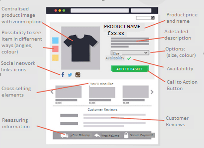
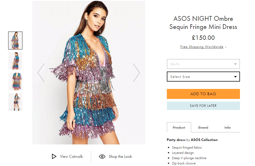
With no means to touch or try products, eshoppers need to see every angle in order to form an opinion before buying. To satisfy online browsers, offer them multiple high-definition visuals with the possibility to zoom in to see products in even more detail. To go a step further in the shopping experience, you can also give your images a 360 ° interactive dimension or even create videos to present your products. Among internet users favourite formats include 360 ° anmiation (55.64 %) and multi-angle photographs (30.83 %). Finally, make sure your colours and proportions are the highest quality to ensure your visuals are as attractive as possible.
Cross-Channel Offers
If you have physical stores running parallel to your ecommerce business, don’t neglect the cross-channel dimension, which enables you to create a bridge between your online and offline activity. Now unavoidable in the purchase process, cross-channel helps to cope with increasingly demanding consumers, who seek flexibility in their purchases. Therefore, don’t hesitate to highlight the availability of your products both in your online shop and also in your physical stores, to offer your customers as much choice as possible. You can even combine them, by offering your customers the possibility to order their products online and to pick them up in store, with Click and Collect. More and more stores are offering this possibility, including M&S and WH Smiths.
The Visibility of your Call to Action Buttons
To maximize your chances of converting, your Call to Action buttons must be clearly identifiable in your product pages to spur action. Orange, green or grey, it must be in keeping with the graphic identity of your online store. It should also be strategically positioned to make it as easy as possible for online shoppers to place their orders.
Reassurance
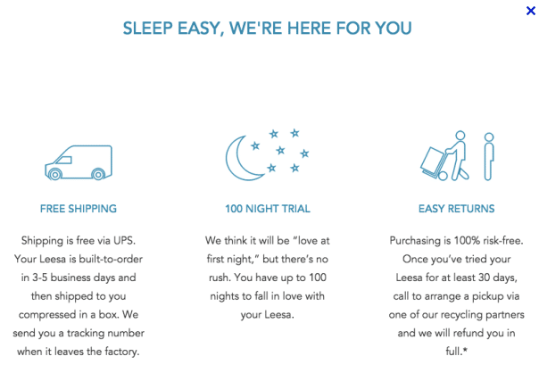
In order to reassure your customers, be as transparent as possible, highlight elements relating to the payment process, and information on delivery and returns. Since June 2014, merchants have been obligated to inform users of such information before validation of their shopping baskets.
Customer Reviews
Customer reviews play an important role in one shoppers’ purchase process, as they enable them to make an informed decision based on the positive/negative experiences other people who bought the item have had. According to Google, product pages which value showing customer reviews have a 17% higher click through rate. If you get negative feedback from clients, it is important to listen and identify the source of the problem, so as to resolve it quickly and ensure that it does not happen again.
Cross-Selling
A real performance booster, cross-selling is a technique used to offer e-shoppers additional products, supplementary to the one they have chosen to look at in more detail on the product page. This is the opportunity for you to increase your customers average basket value, by offering them a complete package (ie, if a client is looking at a dress, suggest shoes and a bag to go with it).
Social Networks
To bring a social dimension to your online store, add button links to Facebook, Pinterest and Twitter on your product pages. These buttons allow e-shoppers to share their new purchases or to save their favourites in a pile before purchasing them.
Your e-commerce library
E-commerce for Retailers
Learn moreE-commerce for Brands
Learn moreL'Oréal Luxe Success Story
Learn moreSign up for our newsletter
By submitting this form you authorize Lengow to process your data for the purpose of sending you Lengow newsletters . You have the right to access, rectify and delete this data, to oppose its processing, to limit its use, to render it portable and to define the guidelines relating to its fate in the event of death. You can exercise these rights at any time by writing to dpo@lengow.com

Trending Posts
Marketing channels
Where does Gen Z shop online?
Gen Z online shopping is transforming the digital marketplace, setting trends that redefine what it means to engage with brands…
16/04/24
9'
Marketplaces
The Top 10 Marketplaces in Europe
The e-commerce scene is a vibrant mix of marketplaces in Europe. These aren't just websites; they're bustling hubs where millions…
08/12/23
7'
Marketplaces
Lengow Now Fully Supports Zalando Logistics Solutions ZSS and ZRS
Zalando, one of Europe’s leading fashion marketplaces, continues to raise the bar with its advanced logistics and fulfillment programs. After…
12/12/24
4'
Marketplaces
How to win the Buy Box on Marketplaces (Amazon, Zalando, etc.)
What is the most important thing for marketplace sellers? Exactly, the Buy Box! If you don't have the Buy Box…
02/04/24
10'
Marketplaces
How to Sell on Temu? Best Tips
Emerging under the vast umbrella of PDD Holdings Inc., Temu has skyrocketed in popularity as a shopping sensation from China…
17/08/23
5'


