How to improve your ecommerce product pages
22/07/14
3'
Great news! The visitor has landed on your site and clicked on a product page! But the battle is not won yet… Your visitor has not been converted to a customer yet. So how can you design your product pages to facilitate and encourage those final all important clicks…
Concise copy
When writing your product descriptions you need to not only describe your products, but to sell them. The description will allow the visitor to decide if the product meets their expectations. Avoid being too wordy and keep it reader friendly, consider using bullet points, headings and subheadings if appropriate. The average shoppers decides if they want the product or not in 90 seconds. Therefore, quit the blah blah and get straight to the point. Let the visitor know what the product can do for them: how it will make their life easier, what problem it will solve, etc. Copy can also optimise your ranking in search engines. By putting yourself into the shoes of the potential customer and using the terminology that they would use when searching your product, you will be displayed higher in search results.
Don’t forget that product pages are also a great place for cross selling and upselling, so don’t hesitate to suggest other articles to complement the product they are viewing, or to display other similar products. Do not neglect to include details of shipping, payment and returns policies. And of course, let the reader know the availability of the stock. If a visitor is looking at a product which is low in stock, knowing this might give them the nudge they need to make the purchase.

Awesome images
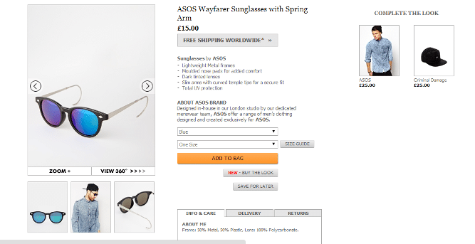
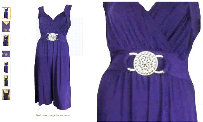
Better quality pictures sell more products. Online shopping is such a visual experience. Unlike in offline shopping, online shoppers cannot hold and feel the item, therefore your need images that accurately represent your products and that reassure customers of their quality. Include several photos from several angles and consider using a 360 degree picture and/or a hover over zoom feature.

Try to shoot all your product photos in a similar style with a similar background, this reinforces your professionalism and gives visitors a consistent browsing experience. When deciding the background remember that your product needs to be the focal point, so you don’t want a background that will distract from it.
Don’t forget search engines when uploading your images. Make sure that you add relevant, keyword rich alt texts so search engines know exactly what the picture is, which can result in a higher ranking on search results.
Clear call to action buttons
Add a clear button for purchasing the product. Different wordings could have different results. For example, you could try “add to cart”, “buy now”, or “purchase now” and see if this has an effect on conversation rate. Think about adding a “add to wish list” button for hesitant buyers who may want to think more and come back later.
Speedy
Loading time is a major contributor to cart abandonment. Keep product page loading time speedy by resizing images for different screen resolutions, this is the quickest way to improve the speed of your site. New image format WebP allows you to compress images by a further 25-30% compared to tradition formats such as JPEG and PNG, however, it is not supported by all browsers.
By reducing scripts and moving them to the end of your HTML templates you can make the site faster and display primary content as other parts of the page load. You may want to look at using a quick and reliable CDN (content delivery system). Although cloud services are becoming more and more affordable, they do not replace the need for a CDN partner.
Reviews
A couple of weeks ago we published an article on the Importance of customer reviews and how to get them. Many studies have shown a strong positive correlation between reviews and conversion. For example, a recent case study by Bazaar Voice found that products with reviews have a 12.5% higher conversion rate than those without. Furthermore, customer reviews are significantly more trusted than product descriptions. So make sure you have a space dedicated to reviews on your product pages.
Finally, make sure you test any changes you make to check if they are having a positive effect on conversion or not. Check out the Lengow Hub to find some great tools for A/B tests.
Your e-commerce library
E-commerce for Retailers
Learn moreE-commerce for Brands
Learn moreL'Oréal Luxe Success Story
Learn moreSign up for our newsletter
By submitting this form you authorize Lengow to process your data for the purpose of sending you Lengow newsletters . You have the right to access, rectify and delete this data, to oppose its processing, to limit its use, to render it portable and to define the guidelines relating to its fate in the event of death. You can exercise these rights at any time by writing to dpo@lengow.com

Trending Posts
Marketing channels
Where does Gen Z shop online?
Gen Z online shopping is transforming the digital marketplace, setting trends that redefine what it means to engage with brands…
16/04/24
9'
Marketplaces
The Top 10 Marketplaces in Europe
The e-commerce scene is a vibrant mix of marketplaces in Europe. These aren't just websites; they're bustling hubs where millions…
08/12/23
7'
Marketplaces
Lengow Now Fully Supports Zalando Logistics Solutions ZSS and ZRS
Zalando, one of Europe’s leading fashion marketplaces, continues to raise the bar with its advanced logistics and fulfillment programs. After…
12/12/24
4'
Marketplaces
How to win the Buy Box on Marketplaces (Amazon, Zalando, etc.)
What is the most important thing for marketplace sellers? Exactly, the Buy Box! If you don't have the Buy Box…
02/04/24
10'
Marketplaces
How to Sell on Temu? Best Tips
Emerging under the vast umbrella of PDD Holdings Inc., Temu has skyrocketed in popularity as a shopping sensation from China…
17/08/23
5'


