It’s 2017 – Time to Optimise Your Checkout Process
18/01/17
3'
Bye bye 2016, and hello 2017! It’s time to make some lasting resolutions for your business. This year, put your customer at the heart of the checkout process to provide an optimum shopping experience and in doing so, increase your sales.

Throughout the shopping process, several obstacles can occur. These are mainly due to doubts the customer has with the fact that they cannot physically see their product before they buy it. However, there are also some obstacles that can be avoided – such as the complexity of the checkout process, and worries about payment security. Here are some ways you can make the process smooth for your customers, to ensure they complete their purchase and stay loyal to your brand:
Make the basket page persuasive
The basket page is a crucial step – this is the moment when the customer decides whether or not they’re going to buy the products. It’s therefore essential to keep them in the right frame of mind for buying.
To do this, be sure to provide a clear and complete order summary and visibly display customer service contact information. Calls to action such as “confirm my shopping basket” or “continue shopping” must also be displayed. To boost these, you can use A/B testing. With this method, you will be able to identify if your customers are more receptive to certain layouts. Choosing the right colour and location can increase your click through rate and therefore your sales. According to an infographic by JustUno, 93% of consumers consider visual appearance to be the key deciding factor in a purchasing decision.
Reassure your customers about payment security
Among North American consumers, 25% of online shoppers consider sharing financial or personal data as an obstacle to shopping. Nearly 60% of shoppers worldwide would drop out of a purchase if their preferred payment method was displayed on a retail site’s homepage but wasn’t available at checkout. Shoppers therefore need plenty of reassurance to keep them on track to buy.

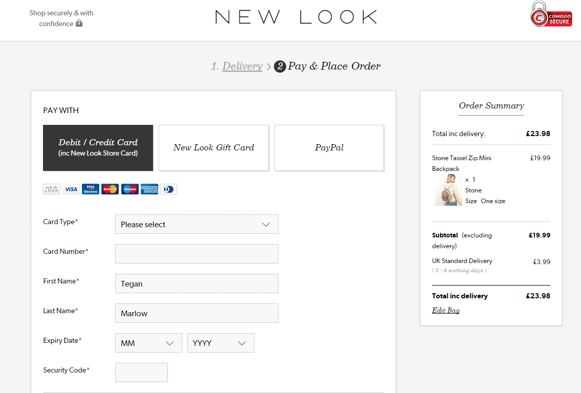
61% of consumers are willing to abandon a purchase if they find it unreliable. To reassure your customer and banish all fears about online payment, use secure systems and communicate this using visual elements, such as pictograms or padlocks. In terms of expectations, these differ between countries, so adapt your system to the market you’re selling on.
Think mobile
Despite the fact that the number of desktop sales remains higher than the number of mobile sales, in 2015, mobile accounted for 20% of European online spending. Mobile is therefore an important part of the online shopping market and should not be overlooked in your e-commerce strategy.
When designing your mobile shopping site, it’s important to bear in mind that the screen size is much smaller. When the customer is typing in information, 50 to 80% of the screen is occupied by the keyboard. Prioritise the most important information, remove any unnecessary steps, and opt for a system that automatically fills out the customer’s information (for example, their city according to postal code).
You should also pay attention to settings if you’re selling on an app. Whilst using a shopping app, the customer sometimes has to exit the app to go to the settings area on their phone, to edit, for example, location settings or notifications. This moment of redirection can be seen as a big obstacle that causes people to abandon their shopping. You’d need to therefore explain simply why updating these settings is essential.
Keep in touch after the purchase
The work doesn’t finish once the order’s confirmed – you need to continue your relationship with the customer!

To reassure the shopper after their purchase, send a confirmation email with a reminder of everything they’ve bought, and the option to download this confirmation in various different formats. This is also the ideal time to offer a coupon code and promote products related to their purchase, to encourage them to return to the site. Setting up share buttons or surveys is also an easy way to retain and reach new customers. According to Gallup, customers who are fully engaged represent 23% premium in terms of share of wallet, profitability, revenue, and relationship growth compared with the average customer.
See also: How to Reduce Shopping Cart Abandonment on Your Ecommerce Site
Source: L’optimisation du tunnel de commande by Capitaine Commerce and Wexperience
Your e-commerce library
Clarins x NetMonitor Success Story
Learn moreSuccess on Marketplaces
Learn moreCompetitive Intelligence
Learn moreSign up for our newsletter
By submitting this form you authorize Lengow to process your data for the purpose of sending you Lengow newsletters . You have the right to access, rectify and delete this data, to oppose its processing, to limit its use, to render it portable and to define the guidelines relating to its fate in the event of death. You can exercise these rights at any time by writing to dpo@lengow.com

Trending Posts
Marketplaces
The Top 10 Marketplaces in Europe (2026)
The e-commerce scene is a vibrant mix of marketplaces in Europe. These aren't just websites; they're bustling hubs where millions…
02/01/26
8'
Marketing channels
ChatGPT Ads and advertising on GenAI Search Engines: what you need to know
Advertising on generative AI-based search engines (GenAI) marks a new era in digital marketing. After two decades dominated by traditional…
18/01/26
8'
Marketplaces
The French Marketplace Landscape: What Brands Need to Know
France has quietly become Europe's marketplace laboratory. Lengow's exclusive ranking reveals why traditional retailers, not tech giants, dominate the game.…
08/01/26
6'
E-commerce Trends
Google’s Universal Commerce Protocol: The End of E-Commerce as We Know It?
On January 11, 2026, at the NRF Retail's Big Show in New York, Google unveiled the Universal Commerce Protocol (UCP),…
16/01/26
6'
Marketing channels
What the World Is Unboxing on TikTok and Instagram (Haul & Unboxing Index 2025)
Opening a package on camera has become much more than simple entertainment. In 2026, "haul" and "unboxing" videos serve as…
20/01/26
7'


